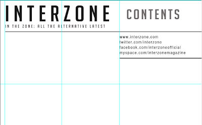
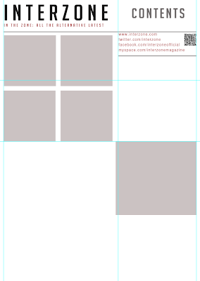
 I have started to create my contents page, and as a starting point I started to plan and make the layout of the page. This is the process so far.
 First I typed the title on the top left hand side of this page, and the title 'contents on the right hand side. I wanted to make the typography font colour 'sleek' and professional looking as featured in almost all alternative music magazines, therefore I have made the main colours black and dark grey.

I then created a section where interactive information such as my magazines social networking sites; twitter, facebook and myspace. And also the magazines official website.A phone scan code is also placed in this section so that readers can access exclusive features with their phone.I have also decided to use red typography to highlight important information on this page, it also links back to the red 'brand' colour associated with Interzone music magazine.I then inserted the title on the left hand corner and the title 'contents' on the top right. I also used grey rectangle shapes to create and plan the layout of my four part grid where photographs will go. I also placed a larger grey box where the cover story photograph will be, this box is placed in the 'featured' column of this contents page.
Next I dragged a number of lines from the rulers on Photoshop to make sure my contents page will be in line. I also added the subheading 'featured' in red typography on the right hand column of this contents page. This is wear all the exclusive sections and information in my magazine will be mentioned.
I have also selected a photograph from my double page spread photo shoot of my created band being interviewed. This gives insight of what is featured in this cover story and engages the reader to read the article.

No comments:
Post a Comment