I decided to use the both I and my fellow peers preferred.
I then edited the image. Before I inserted the photo into Photoshop I decided to edit out blemishes from the models faces and I want to make them appear fresh faced, attractive and appealing to my target audience. It is also an ideology for models to have perfect skin when featured in a magazine.

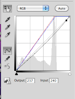
I then used Hue/Saturation in Photoshop to drain and decrease the saturation of certain colours to of the models which is a typical convention in music magazines. I also increased the lightness of the photograph to add to the achieved look and effect i did this both with curves and Hue/Saturation.
This how my page looks with my photo newly edited. I may slightly alter the colours but I will be keeping the overall look of the photograph pale and drained like I found when researching alternative music magazine front cover conventions.


No comments:
Post a Comment