I decided that I wanted a caption and introduction to the double page spread on the right hand page under the large photograph titles 'Exclusive' as it would draw attention from the reader. However, the typography was not very readable in contrast with the background as I chose simplistic text to suit the alternative genre's forms and conventions Therefore, I inserted two white boxes, similarly to the one on my front cover. I created this shape which was inspired by a double page spread in a Q magazine issue. I also made the box transparent to again suit the forms and conventions of the genre and to match the page. However, I still need to change the colour of the 'Exclusive' to a pale blue to match the pull quotes on the following page.
Title / Masthead
I have now replaced my photographs which were at the top of the page with a masthead as I think it fits the ideologies and conventional layout of a music magazine article
Article Photograph
As I no longer have the original layout of three photographs at the top of the page I still needed to fins somewhere in my article layout to fit a photograph. I decided I now only wanted one photograph of the band member in the interview and fitted it into the third column of my article and also added a caption.
Article Pull Quotes
Article Pull Quotes
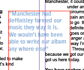
I have now added two pull quotes to my double page spread article. I made the typography of these quotes pale blue as it is a typical conventional alternative colour. It also anchors the pale blue in one of the band members shirt. I have also altered the positioning of the quotes to be placed in between two columns to give to article and overall page more of an alternative 'look'.


No comments:
Post a Comment