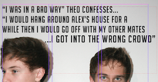
Here is the process of my pull quote which is at the top of the left hand page of my double page spread and acts as the mast head/ title.
I chose a quote which was most intriguing and one that I believed would pull the audience in to wanting to read the article. However, it was too long and crowded the page. Because of this, it did not do its job of attractive the reader and is was not simplistic or punchy enough .
Too fix this, first of all I added a ellipsis and made the typography bold and slightly larger for the last sentence of the pull quote, this is now the most eye catching part of the quote and also part that has the most impact and shock on the reader.
Next, I decided to cut out most of the quote so that it looks more simplistic, more visually appealing and easier to read.


No comments:
Post a Comment