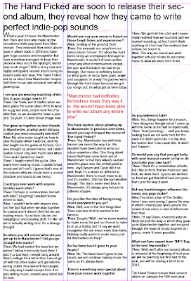
 I have now completed setting out my double page spread article on my right hand page. I have set it out in three columns and this follows the forms and conventions and the ideologies of a music magazine articles layout. I have also inserted a mast head replacing the photographs at the top of the page; I did this because I feel this layout suits my double page spread better. I have also inserted a pull quote, however I am not sure on the colour as I want it to suit my genre slightly better and to be different from the reds that I have used in my other magazine pages; I also want to insert another pull quote somewhere in one of these columns.
 I have also leave a space for a photograph of the band being interviews which will add to the 'exclusive' content of this page. I will also add a caption under this photograph once it is inserted.
No comments:
Post a Comment