
Wednesday, 22 May 2013

Tuesday, 21 May 2013

Monday, 20 May 2013

Wednesday, 16 January 2013
Evaluation
Introduction
For this coursework I have created a music magazine product. 'Interzone' is an alternative music magazine targeted at young late teens to twenties. I chose to create an alternative music genre magazine as I found from my research that there is not a large variety of existing alternative music magazines for the large fan base of the genre. I therefore stuck to the forms and conventions of alternative music magazines to make my media product as professional looking and to resemble existing popular magazines. The research I carried out also helped me understand the public's ideologies and opinions. The preliminary task that I carried out which was to create a college music magazine, was also a large help in learning and understanding the basics of a magazine's layout etc. After my research and planning tasks I completed a front cover, contents page and double page spread for Interzone music magazine and overall I am please with the end product.
Q1. In what ways does your media product use, develop or challenge forms and conventions of real media products?
Q2. How does your media product represent particular social groups?
Q3. What kind of media institution might distribute your media product and why?
For this coursework I have created a music magazine product. 'Interzone' is an alternative music magazine targeted at young late teens to twenties. I chose to create an alternative music genre magazine as I found from my research that there is not a large variety of existing alternative music magazines for the large fan base of the genre. I therefore stuck to the forms and conventions of alternative music magazines to make my media product as professional looking and to resemble existing popular magazines. The research I carried out also helped me understand the public's ideologies and opinions. The preliminary task that I carried out which was to create a college music magazine, was also a large help in learning and understanding the basics of a magazine's layout etc. After my research and planning tasks I completed a front cover, contents page and double page spread for Interzone music magazine and overall I am please with the end product.
Q1. In what ways does your media product use, develop or challenge forms and conventions of real media products?
Q2. How does your media product represent particular social groups?
Q3. What kind of media institution might distribute your media product and why?
Q4. Who would be the audience for your media product?
Q5. How did you attract/address your audience?
For my focus group I asked a number of people within my target audience to answer questions to gain their opinions on Interzone's magazine pages. This would allow me to see if Interzone magazine is successful in targeting its audience. These questions were:
- What draw your attention to the most about my front cover?
- Do you think the images on the front cover and throughout the other pages relate to each
other?
- How do you think the main image on my front cover draws the audience in?
- Do you think my Masthead would be regognisable as a brand through the typography?
- Do you think my contents page looks professional? And if so what do you like most about it?
- Do you think that the contents page looks like it belongs to the alternative music genre?
- What on my double page spread draws your attention to?
My focus group notices mentioned a number of different aspects and features about my Interzone's magazine pages that I planned thoroughly this shows that even small aspects are noticed and can make a vast difference to the look of a magazine page. One of these featured included my front covers main large image. My focus group mentioned that the image attracted the audience through the placement of the models, matching shirts and direct eye contact. All of these things, I planned carefully before taking the photo shoot and so through the positive response from the group reflects that this was successful. Another point that was raised about the main cover image was that the clothing of the band members were different in comparison to the rest of the front covers colour scheme and so made the two band members stand out and draw the audiences attention. Another member from the focus group said that she liked the shadows on the background, and if they were not there the page would look flat; this was one of the main point I decided on for my front cover after my research; I decided that using the original background from the photo shoot makes a front cover look more professional and not give the page a harsh obvious edited look if I were to cut out the models and place them on an 'artificial' edited background.
They also stated that my images throughout the pages related to each other as they shows and represented the magazines genre and you can see that the all come from the same magazine issue; and so the pages all link together.
For the question on whether the masthead on my front cover created a regognisable brand my focus group told me tha it was deffinatley memorable as it is different. When moving on to questions on my contents page my focus group came up with a number of different opinions and points. They stated tha the layout and structure looked professional and the convergence at the top of he page was clear, they also stated that it looked like a 'real contents page' because of these points. The layout and structure was the main thing that i wanted to get right for this alternative music magazine contents page as I learnt from my research that the layout and structure of the page can make up the whole look and appeal of a contents page, I am therefore please that they agreed that it looked as if it belonged to an alternative music magazine as this shows that it is important to follow the appropriate forms and conventions and also look at the audiences ideologies in order to achieve a successful reaction and appeal to the target audience.
For the results of my question on my double page spread, they stated that the subjects in the large image and both pull quotes caught their attention. One of the members said that the image suggested a band member had 'attitude', another said that the picture is different as one of the band members is looking away and so it makes you want to read about it. This is the type of reaction i wanted to engage with my target audience and is why I placed a large image on my double page spread with features such as one of the models turned away and blank facial expressions to engage an interest in reading the article to find out why the band members have presented themselves like this, what the poses represent and what is the underlying story line.
Overall I am happy with the responses and feedback from the focus group as they recognised many features, codes, forms and conventions that I worked on for my three magazine pages for my final media product.
Q6. What have you learnt about technologies from the process of constructing this product?
While planning and creating my final music magazine pages I have learnt many new skills from the technologies I have used during the process of construction including photography, Blogger, Prezzi, Indesign and more.
Firstly, one of the main and most important skills I have learnt is those of photography. I quickly learnt from my preliminary task mistakes as I took most of my photo shoot photograph in landscape with a busy background which I found difficult to choose from and to work with. I therefore learnt that planning my photo shoots for my final magazine pages is essential.
The main skill I gained therefore, is proposing and planning my photo shoots. My front cover photo shoot was most important to plan as I decided after my research that the most professional and conventional looking front covers have plain unedited backdrops which were used on the photo shoot; I therefore realised I had to plan out the positioning and framing of the models in the photograph to allow room for the masthead and cover lines when it came to editing.


Conclusion
Overall, I am please with my final media product and outcome of my planning and construction of my magazine 'Interzone'. I feel that I have followed the codes and conventions as well as the ideologies of alternative music magazines as well as challenging and developing them in some ways. I did this by my initial research and also referring to existing alternative music magazines throughout the process of planning and creating my product, so that my product would resemble and relate to the alternative music genre and appeal to the target audience.
My research helped me the most throughout this coursework and helped me achieve my aimed results. This is because it gave me ideas and inspirations though the ideologies forms codes and conventions of which I discovered of the alternative music genre and alternative music magazines. I think that because I followed the basic guidelines, Interzone music magazine attracts its target audience of the alternative music genre listeners and readers.
The main reason I chose to create a magazine within the 'alternative' genre is because I found from my initial research there is a limited choice and small variety of available existing alternative music magazine in contrast with a large fan base of the music genre, this fan base consists of late teens to late twenties, therefore I wanted to create a popular alternative music magazine for this fan base.
As a result of following, challenging and developing the codes and conventions of the alternative genre and what is popular among the target audience I feel I have achieved and produced an alternative music magazine that represents the alternative music genre and its audience as well as being at a high quality and looking professional which would sell to its audience on the shop shelves as well as online.
Q5. How did you attract/address your audience?
For my focus group I asked a number of people within my target audience to answer questions to gain their opinions on Interzone's magazine pages. This would allow me to see if Interzone magazine is successful in targeting its audience. These questions were:
- What draw your attention to the most about my front cover?
- Do you think the images on the front cover and throughout the other pages relate to each
other?
- How do you think the main image on my front cover draws the audience in?
- Do you think my Masthead would be regognisable as a brand through the typography?
- Do you think my contents page looks professional? And if so what do you like most about it?
- Do you think that the contents page looks like it belongs to the alternative music genre?
- What on my double page spread draws your attention to?
My focus group notices mentioned a number of different aspects and features about my Interzone's magazine pages that I planned thoroughly this shows that even small aspects are noticed and can make a vast difference to the look of a magazine page. One of these featured included my front covers main large image. My focus group mentioned that the image attracted the audience through the placement of the models, matching shirts and direct eye contact. All of these things, I planned carefully before taking the photo shoot and so through the positive response from the group reflects that this was successful. Another point that was raised about the main cover image was that the clothing of the band members were different in comparison to the rest of the front covers colour scheme and so made the two band members stand out and draw the audiences attention. Another member from the focus group said that she liked the shadows on the background, and if they were not there the page would look flat; this was one of the main point I decided on for my front cover after my research; I decided that using the original background from the photo shoot makes a front cover look more professional and not give the page a harsh obvious edited look if I were to cut out the models and place them on an 'artificial' edited background.
They also stated that my images throughout the pages related to each other as they shows and represented the magazines genre and you can see that the all come from the same magazine issue; and so the pages all link together.
For the question on whether the masthead on my front cover created a regognisable brand my focus group told me tha it was deffinatley memorable as it is different. When moving on to questions on my contents page my focus group came up with a number of different opinions and points. They stated tha the layout and structure looked professional and the convergence at the top of he page was clear, they also stated that it looked like a 'real contents page' because of these points. The layout and structure was the main thing that i wanted to get right for this alternative music magazine contents page as I learnt from my research that the layout and structure of the page can make up the whole look and appeal of a contents page, I am therefore please that they agreed that it looked as if it belonged to an alternative music magazine as this shows that it is important to follow the appropriate forms and conventions and also look at the audiences ideologies in order to achieve a successful reaction and appeal to the target audience.
For the results of my question on my double page spread, they stated that the subjects in the large image and both pull quotes caught their attention. One of the members said that the image suggested a band member had 'attitude', another said that the picture is different as one of the band members is looking away and so it makes you want to read about it. This is the type of reaction i wanted to engage with my target audience and is why I placed a large image on my double page spread with features such as one of the models turned away and blank facial expressions to engage an interest in reading the article to find out why the band members have presented themselves like this, what the poses represent and what is the underlying story line.
Overall I am happy with the responses and feedback from the focus group as they recognised many features, codes, forms and conventions that I worked on for my three magazine pages for my final media product.
Q6. What have you learnt about technologies from the process of constructing this product?
While planning and creating my final music magazine pages I have learnt many new skills from the technologies I have used during the process of construction including photography, Blogger, Prezzi, Indesign and more.
Firstly, one of the main and most important skills I have learnt is those of photography. I quickly learnt from my preliminary task mistakes as I took most of my photo shoot photograph in landscape with a busy background which I found difficult to choose from and to work with. I therefore learnt that planning my photo shoots for my final magazine pages is essential.
The main skill I gained therefore, is proposing and planning my photo shoots. My front cover photo shoot was most important to plan as I decided after my research that the most professional and conventional looking front covers have plain unedited backdrops which were used on the photo shoot; I therefore realised I had to plan out the positioning and framing of the models in the photograph to allow room for the masthead and cover lines when it came to editing.
I planned other aspects to my photo
shoots such as the lighting to make my photographs looking as professional as
possible. I therefore mostly used natural lighting to deter away from harsh
shadows on the plain backdrops I used. I also learnt that natural lighting enhances
features of the photograph and therefore creates a high quality, visually
appealing photograph. High quality professional looking photographs also depend
on what camera you use and what setting is set at, I used a Cannon DSLR and
took the my photo shoots on portrait mode as I found it was best for taking
photographs of faces and further learnt the skill of how to capture the correct amount of zoom, focus and colour balance.
When constructing my magazine pages I used two adobe software programs which I had no previous skills on or knowledge of before starting this course, these were Photoshop and Indesign. As a result of working a lot on these two programs, particularly Photoshop, I have gained the needed skills and knowledge to help me create and complete my magazine pages.
When working ins Photoshop I wanted to keep editing my images to a minimum, I mostly wanted to concentrate on editing and draining the colours of the photographs to gain the 'alternative' look. I learnt that to do this the I had to use editing tools such as 'colour balance', 'Hue/Saturation' and 'Brightness and Contrast'; after using these three tools I managed to achieve my wanted professional conventional alternative look to my photographs without over editing.
I also also learnt how to adapt my masthead 'Interzone' to make the name more regognisable and memorable, and also to give the name of my magazine a 'brand'. I used the 'stroke tool' to achieve this and make it stand out from the page but in a subtle 'alternative' way which fitted in with the forms and conventions of the page and music genre of the magazine. However, I also had problems with the masthead 'Interzone', one of them being that I inserted a line through the 'Z', to give it a brand identity, and could not match the colour exactly to the rest of the typography of the masthead. I learnt to use the 'colour pick' tool in Photoshop which solved the problem as with this tool you and select existing colour on the page and make it the same. Another problem was the spacing and size of the typography, for this problem I discovered a tool that allowed me to accurately space each character in my masthead equally across the page.
Other tools I used to help me achieve accurateness included grids and rulers, these came most helpful when constructing my contents page in Photoshop as it allowed me see easily where to place each piece of text to be equally spaced. It also helped with my photo grid on my contents page as the human eye can easily see if a gap or space is not identical or lines are not straight I had to make sure that my photo grid had identically spaced gap between each photograph and to make sure the were lined up straight. The rulers helped me do this more accurately and easily.
Indesign was most difficult to get used to as I only used this program for my double page spread, however I managed to quickly achieve the skills I need to construct my page, mostly through trial and error. Indesign was used for creating my double page spread as it is better at working with text, as as I would be working with a lot of text this was the most appropriate program to use. A tool that I learnt to use in Indesign was a tool that inserted a chosen number of columns which made it easier to insert an type text and gave the page a professional look. It also allowed text to be continued to the next column, overall I found this tool helped me achieve a professional looking double page spread.
Other technologies I used for this project included Blogger, Prezi, PowerPoint, Youtube and SlideShare. I used Youtube, Prezi and SlideShare to produce this multimedia evaluation, however to present the different questions into the post I has to learn how to insert the embed link into the HTML.
The website 'Blogger' which was the most used technology throughout made this project a lot easier than paperwork. This was because I learnt that it was easier to keep up to date on work, organise and keep on order. It also made the work a lot more interesting and interactive as the website allowed us to comment on each others blog posts and give advice which came as an advantage I learnt a lot about the website and found it was easy to present the work I was doing easily as I could quickly upload screenshots and insert blog posts both about my works process and my own feeling an opinions.
Working online also allowed me to use multimedia technologies particularly in this evaluation post which I enjoyed learning how to use. The main technology being Prezi. Prezi is similar to a PowerPoint presentation but is more visually exciting. It also allowed me to highlight and focus on certain points about Interzone magazine pages which made it easier to explain and talk about.
I had never previously used it before and therefore needed to learn how to use it and gain the knowledge and skills to complete the tasks; for example adding images from my own library and the Internet; also text frames, changing colours of the template and altering the path order.
Overall I learnt a lot about the technologies and programs which I have used for this project, mostly learning knowledge and skills starting from new as I has never used them before. However they helped me construct my final product to be at its best potential that I could by applying the appropriate features and tools.
Q7. Looking back at your preliminary task, what do you feel you have learnt in the progression from it to the full product?When working ins Photoshop I wanted to keep editing my images to a minimum, I mostly wanted to concentrate on editing and draining the colours of the photographs to gain the 'alternative' look. I learnt that to do this the I had to use editing tools such as 'colour balance', 'Hue/Saturation' and 'Brightness and Contrast'; after using these three tools I managed to achieve my wanted professional conventional alternative look to my photographs without over editing.
I also also learnt how to adapt my masthead 'Interzone' to make the name more regognisable and memorable, and also to give the name of my magazine a 'brand'. I used the 'stroke tool' to achieve this and make it stand out from the page but in a subtle 'alternative' way which fitted in with the forms and conventions of the page and music genre of the magazine. However, I also had problems with the masthead 'Interzone', one of them being that I inserted a line through the 'Z', to give it a brand identity, and could not match the colour exactly to the rest of the typography of the masthead. I learnt to use the 'colour pick' tool in Photoshop which solved the problem as with this tool you and select existing colour on the page and make it the same. Another problem was the spacing and size of the typography, for this problem I discovered a tool that allowed me to accurately space each character in my masthead equally across the page.
Other tools I used to help me achieve accurateness included grids and rulers, these came most helpful when constructing my contents page in Photoshop as it allowed me see easily where to place each piece of text to be equally spaced. It also helped with my photo grid on my contents page as the human eye can easily see if a gap or space is not identical or lines are not straight I had to make sure that my photo grid had identically spaced gap between each photograph and to make sure the were lined up straight. The rulers helped me do this more accurately and easily.
Indesign was most difficult to get used to as I only used this program for my double page spread, however I managed to quickly achieve the skills I need to construct my page, mostly through trial and error. Indesign was used for creating my double page spread as it is better at working with text, as as I would be working with a lot of text this was the most appropriate program to use. A tool that I learnt to use in Indesign was a tool that inserted a chosen number of columns which made it easier to insert an type text and gave the page a professional look. It also allowed text to be continued to the next column, overall I found this tool helped me achieve a professional looking double page spread.
Other technologies I used for this project included Blogger, Prezi, PowerPoint, Youtube and SlideShare. I used Youtube, Prezi and SlideShare to produce this multimedia evaluation, however to present the different questions into the post I has to learn how to insert the embed link into the HTML.
The website 'Blogger' which was the most used technology throughout made this project a lot easier than paperwork. This was because I learnt that it was easier to keep up to date on work, organise and keep on order. It also made the work a lot more interesting and interactive as the website allowed us to comment on each others blog posts and give advice which came as an advantage I learnt a lot about the website and found it was easy to present the work I was doing easily as I could quickly upload screenshots and insert blog posts both about my works process and my own feeling an opinions.
Working online also allowed me to use multimedia technologies particularly in this evaluation post which I enjoyed learning how to use. The main technology being Prezi. Prezi is similar to a PowerPoint presentation but is more visually exciting. It also allowed me to highlight and focus on certain points about Interzone magazine pages which made it easier to explain and talk about.
I had never previously used it before and therefore needed to learn how to use it and gain the knowledge and skills to complete the tasks; for example adding images from my own library and the Internet; also text frames, changing colours of the template and altering the path order.
Overall I learnt a lot about the technologies and programs which I have used for this project, mostly learning knowledge and skills starting from new as I has never used them before. However they helped me construct my final product to be at its best potential that I could by applying the appropriate features and tools.


Conclusion
Overall, I am please with my final media product and outcome of my planning and construction of my magazine 'Interzone'. I feel that I have followed the codes and conventions as well as the ideologies of alternative music magazines as well as challenging and developing them in some ways. I did this by my initial research and also referring to existing alternative music magazines throughout the process of planning and creating my product, so that my product would resemble and relate to the alternative music genre and appeal to the target audience.
My research helped me the most throughout this coursework and helped me achieve my aimed results. This is because it gave me ideas and inspirations though the ideologies forms codes and conventions of which I discovered of the alternative music genre and alternative music magazines. I think that because I followed the basic guidelines, Interzone music magazine attracts its target audience of the alternative music genre listeners and readers.
The main reason I chose to create a magazine within the 'alternative' genre is because I found from my initial research there is a limited choice and small variety of available existing alternative music magazine in contrast with a large fan base of the music genre, this fan base consists of late teens to late twenties, therefore I wanted to create a popular alternative music magazine for this fan base.
As a result of following, challenging and developing the codes and conventions of the alternative genre and what is popular among the target audience I feel I have achieved and produced an alternative music magazine that represents the alternative music genre and its audience as well as being at a high quality and looking professional which would sell to its audience on the shop shelves as well as online.
Tuesday, 8 January 2013
Audio Recording
For the second question of my evaluation I am using an audio recording to present my thoughts and evaluation on my product relating to the question. I have just finished recording my audio recording and it took me several attempts to get right as I found it strange and uncomfortable talking aloud rather than typing it out. However, I got used to it after a while and managed to finish a recording with few mistakes. I wrote a transcript but tried to improvise and use it as a reference rather than reading off a page to make my voice sound as natural as possible, this was the main cause for my mistakes.
Thursday, 20 December 2012
Using Prezi
I have now started my evaluation and for the 1st question I will be using multi-media in the form of Prezi. I have never used Prezi before so it will need some getting used to however I feel confident that I will be able to write and present the important points of my magazine pages using this visually exciting and creative way.
Friday, 14 December 2012
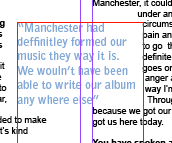
Large Pull Quotes


Here is the process of my pull quote which is at the top of the left hand page of my double page spread and acts as the mast head/ title.
I chose a quote which was most intriguing and one that I believed would pull the audience in to wanting to read the article. However, it was too long and crowded the page. Because of this, it did not do its job of attractive the reader and is was not simplistic or punchy enough .
Too fix this, first of all I added a ellipsis and made the typography bold and slightly larger for the last sentence of the pull quote, this is now the most eye catching part of the quote and also part that has the most impact and shock on the reader.

Next, I decided to cut out most of the quote so that it looks more simplistic, more visually appealing and easier to read.
Double Page Spread Further Development
'Exclusive' box


Article Photograph
I decided that I wanted a caption and introduction to the double page spread on the right hand page under the large photograph titles 'Exclusive' as it would draw attention from the reader. However, the typography was not very readable in contrast with the background as I chose simplistic text to suit the alternative genre's forms and conventions Therefore, I inserted two white boxes, similarly to the one on my front cover. I created this shape which was inspired by a double page spread in a Q magazine issue. I also made the box transparent to again suit the forms and conventions of the genre and to match the page. However, I still need to change the colour of the 'Exclusive' to a pale blue to match the pull quotes on the following page.

Title / Masthead
I have now replaced my photographs which were at the top of the page with a masthead as I think it fits the ideologies and conventional layout of a music magazine article

Article Photograph
As I no longer have the original layout of three photographs at the top of the page I still needed to fins somewhere in my article layout to fit a photograph. I decided I now only wanted one photograph of the band member in the interview and fitted it into the third column of my article and also added a caption.

Article Pull Quotes

Article Pull Quotes
I have now added two pull quotes to my double page spread article. I made the typography of these quotes pale blue as it is a typical conventional alternative colour. It also anchors the pale blue in one of the band members shirt. I have also altered the positioning of the quotes to be placed in between two columns to give to article and overall page more of an alternative 'look'.

Layout Of Double Page Spread Article
 I have now completed setting out my double page spread article on my right hand page. I have set it out in three columns and this follows the forms and conventions and the ideologies of a music magazine articles layout. I have also inserted a mast head replacing the photographs at the top of the page; I did this because I feel this layout suits my double page spread better. I have also inserted a pull quote, however I am not sure on the colour as I want it to suit my genre slightly better and to be different from the reds that I have used in my other magazine pages; I also want to insert another pull quote somewhere in one of these columns.
 I have also leave a space for a photograph of the band being interviews which will add to the 'exclusive' content of this page. I will also add a caption under this photograph once it is inserted.
Wednesday, 12 December 2012
Further development on my double page spread


Tuesday, 11 December 2012
Starting to insert and create my double page spread

Inserting text and my article
 |
| I have now inserted the columns on my double page spread |
To add my article to my right hand page I have inserted three columns. However, I need to remove the columns from the left hand page and shorten the length of the three columns I will soon be inserting my article into as I want the text to start beneath the three photographs at the top of the page.
The left hand page will be for the main title and a large pull quote which will be the main focus point and will reflect the large main photograph I have taken and have chosen to use.
Double page spread

Next I will add more photographs to the right hand side of the double page spread. I will also insert the title and pull quotes around the pictures. The article will be placed within three columns of the second page of my doble page spread with pull quotes and photographs.
Wednesday, 5 December 2012
Starting Double Page Spread
Today I have started to create my double page spread in a software which I have not used before called InDesign; I am looking forward to developing new skills in this software.
Class peer review on blog so far
Today we did a class review, from my review the feedback I reviewed was mostly positive which I am pleased about. My strongest areas are my final contents page, front cover and amount of blog posts I have made about the construction of my final magazine pages. However, the improvement I need to make is write about screen shots on my blog that have no information about them yet. To prevent this from happening again I will be writing about my screen shot on my blog posts as soon as I upload them.
Monday, 3 December 2012
Progess


I have now finished typing up everything on my contents page so I am in the process of spell checking all of my text to make sure my contents page as no repeating of words or incorrect spelling.
Cover story and subscription box

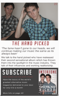
I have now completed my 'featured' column which is on the right hand side of my contents page. I now have finished the cover story part of the contents page by using large typography for the band and 'The Hand Picked' I also used a pull quote from the article.
I have also removed the 'pg' before the page number in the right hand corner of the pictures on my contents page as it look more alternative and professional.
completed photograph contents page grid

Here you can see I have completed my four part grid of photographs. The photographs show an insight of what is featured inside my music magazine. I have also added page numbers on the right hand corners of each photograph to inform the reader what article and page each photograph has been taken from.
I have edited and drained each of the photographs colours to compliment and reflect on my music genre of alternative. I also like the fact I have photographs with musical features in such as the records, headphones and speaker. This as a result makes the contents page look more like its from a music magazine.
Wednesday, 28 November 2012
Editing Images
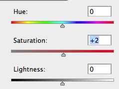
I want to continue the conventional way of editing images in alternative music magazines, draining the flesh colours from the models and making the overall appearance of the photos to be drained, pale, neutral and pastel. In the same way in which I editing my front cover main photo.
In order to achieve this conventional neutral and dull 'look' of the pictures, I used Photoshop's tools such as colour balance, exposure, brightness, saturation lightness and exposure to gain the correct colouring of the photographs.

Tuesday, 27 November 2012
Beginning My Contents Page
 I have started to create my contents page, and as a starting point I started to plan and make the layout of the page. This is the process so far.
 First I typed the title on the top left hand side of this page, and the title 'contents on the right hand side. I wanted to make the typography font colour 'sleek' and professional looking as featured in almost all alternative music magazines, therefore I have made the main colours black and dark grey.

I then created a section where interactive information such as my magazines social networking sites; twitter, facebook and myspace. And also the magazines official website.A phone scan code is also placed in this section so that readers can access exclusive features with their phone.I have also decided to use red typography to highlight important information on this page, it also links back to the red 'brand' colour associated with Interzone music magazine.I then inserted the title on the left hand corner and the title 'contents' on the top right. I also used grey rectangle shapes to create and plan the layout of my four part grid where photographs will go. I also placed a larger grey box where the cover story photograph will be, this box is placed in the 'featured' column of this contents page.

Next I dragged a number of lines from the rulers on Photoshop to make sure my contents page will be in line. I also added the subheading 'featured' in red typography on the right hand column of this contents page. This is wear all the exclusive sections and information in my magazine will be mentioned.
I have also selected a photograph from my double page spread photo shoot of my created band being interviewed. This gives insight of what is featured in this cover story and engages the reader to read the article.
Subscribe to:
Posts (Atom)